We modernized Deezer’s TV interface to improve usability and create a more immersive big-screen experience.
TIMELINE
2022
The challenge
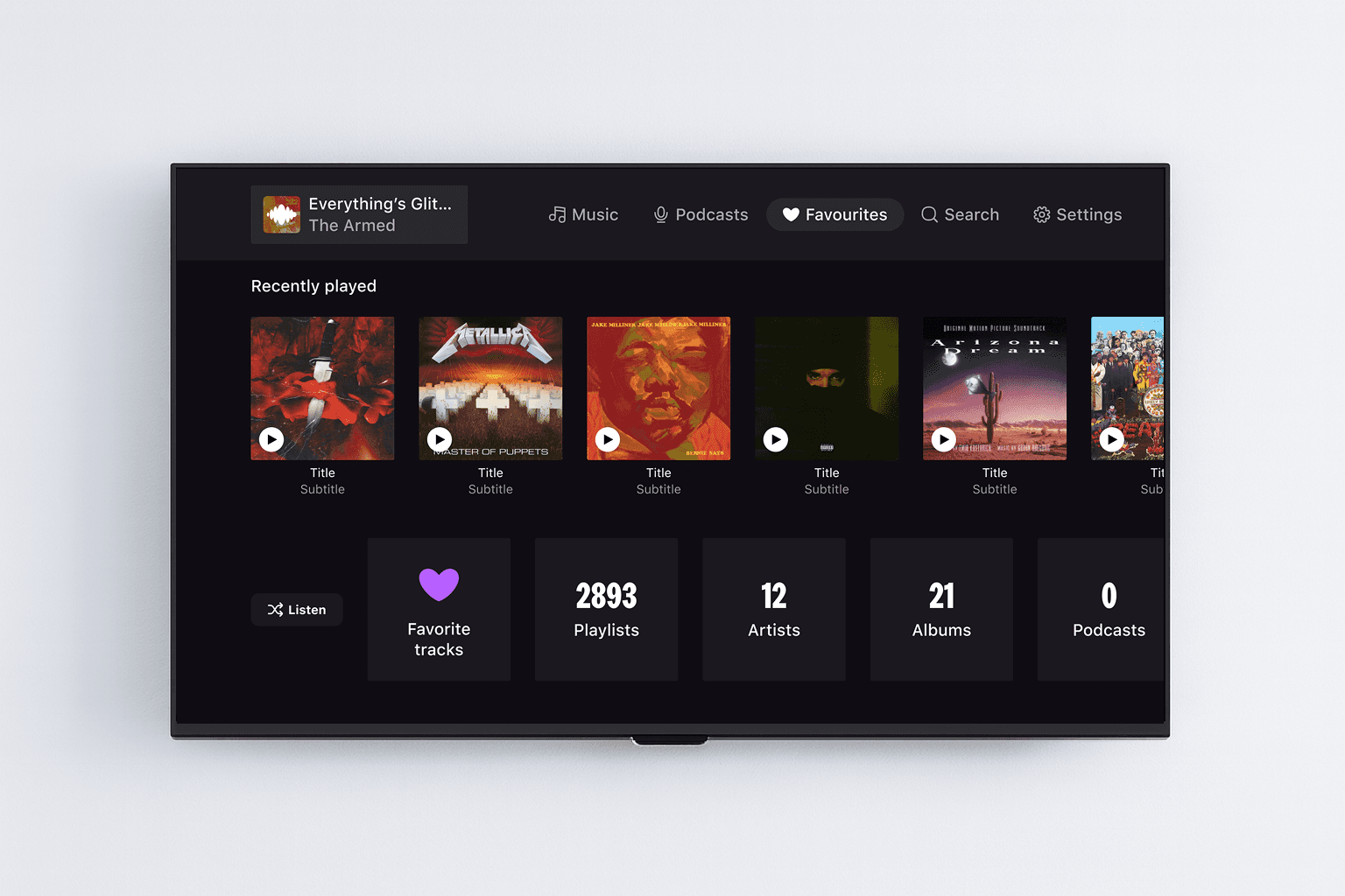
Designing for TV is radically different from designing for mobile or desktop. Users are seated far from the screen, navigating with limited remote-control inputs, and expecting a smooth, lean-back experience that feels effortless. We had to rethink Deezer’s TV experience so it feels truly native to large screens.
The vision
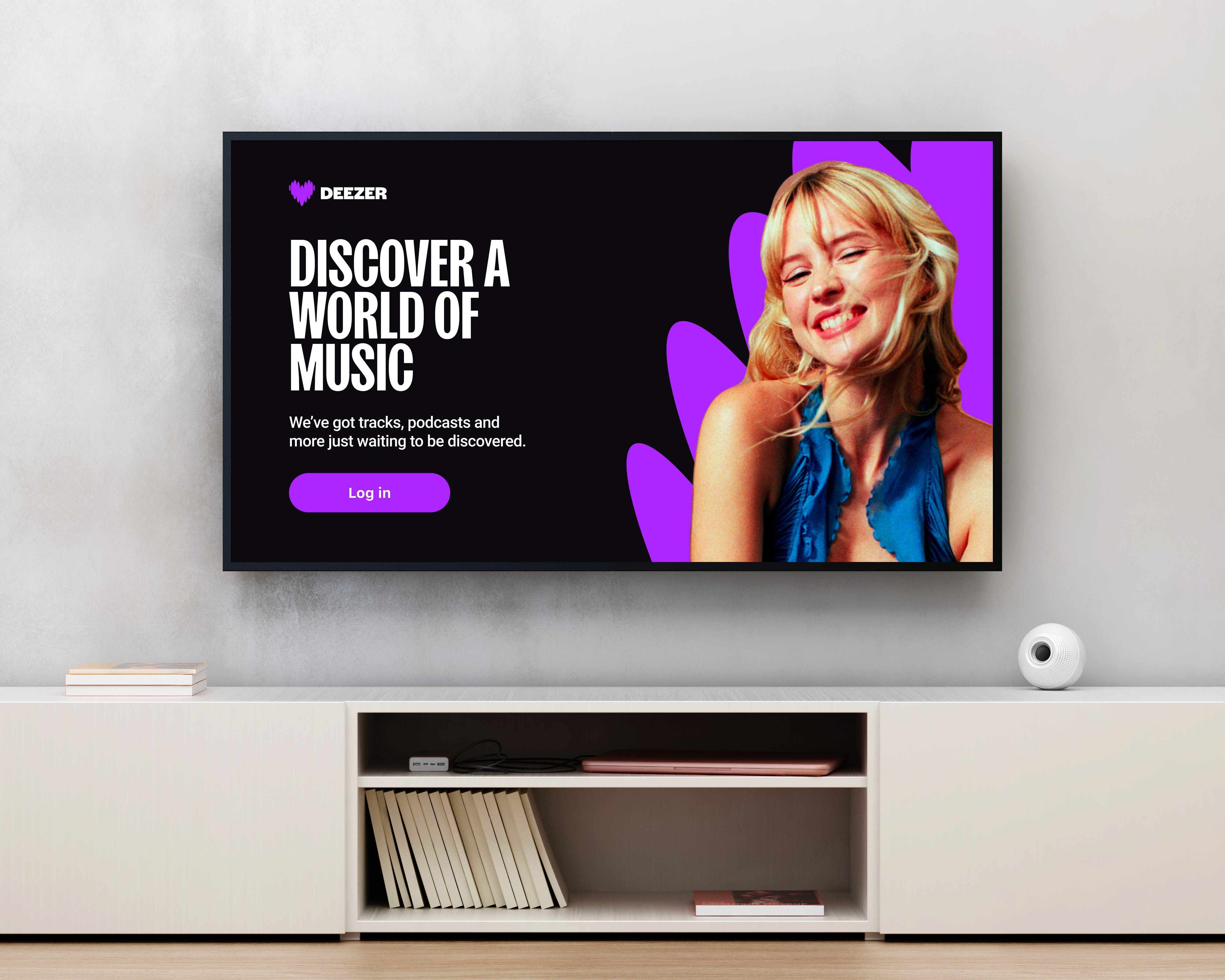
The goal was to bring the emotional feel of music to the big screen, while delivering a modern, premium experience aligned with today’s streaming standards.
The process
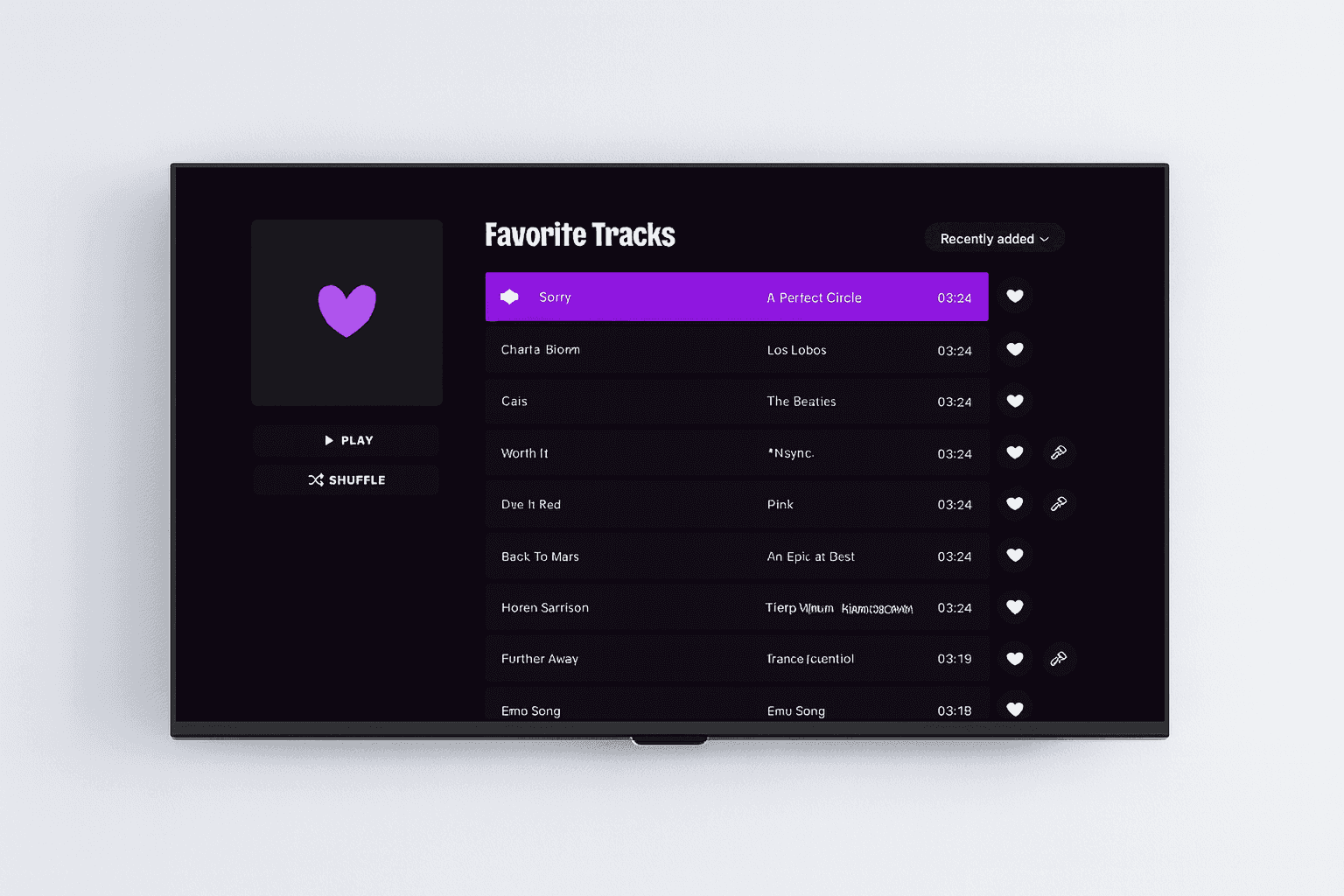
Alongside with a User Researcher and a PM, we started by understanding how users browse music from a distance and what made the previous TV experience hard to navigate. Then I reorganized the information architecture, explored simpler navigation patterns, and tested layouts directly on big screens to validate readability. Once the structure felt right, I refined the UI and built a small, scalable design system to keep the experience consistent across all TV platforms.
The outcome
A clearer, more modern interface that’s easy to browse from the couch, with smoother navigation, better hierarchy, and visuals designed for large-screen comfort.